Tuesday, December 3, 2013

Why do you need CRO?

A recent client was trying to grow his e-commerce business.  He had tried many different marketing avenues including social media, Google Adwords, banner ads, affiliate marketing, re-targeting, advanced SEO, and email just to name a few.

After a number of months, he finally found and optimized a source of traffic that had a positive return on investment.  By this time he had spent almost a half a million dollars trying things that didn't work and his marketing budget was almost gone.  To make matters worse, the profit from this new marketing campaign wasn't enough to replenish his marketing budget AND grow the business.

Here's his numbers for a given month (rounded for clarity):

Marketing Spend - $40,000
Cost per Visitor   - $0.60
Total Visitors       ~ 66,000
Conversion Rate  - 2%
Average Sale       - $40
Revenue              - $53,000
Gross Margin    - $13,000

As you can see, he was only making an extra $13k each month off of a $40k marketing spend.

Now, since the marketing effort is [marginally] profitable (and so many others weren't), traditional [marketing] wisdom is to double your ad spend.  Since your campaign is profitable, theoretically you will double your profit.

However, there's a few unseen problems with this plan. 
Capital - You'll need double the capital to run double the campaign, and this money is likely allocated to other departments (or in my client's case, it was gone.) 
Audience - Assuming your first campaign only reached part of your audience, the cost of reaching all (or more) of your target audience is seldom linear.  Often the more of your audience you intend to reach/attract, the more expensive that opportunity becomes.  (This is like bidding for the #1 spot on Google Adwords vs being #3.)

This is where CRO comes into play in the marketing value equation.


Marketing Value Equation

CRO wisdom is to increase the conversion rate and average sale of already profitable marketing campaigns.  Even just a 30% increase in conversion rate and a 15% increase in average sale would triple the bottom line here.

The actual results were even better; a 70% increase in conversions and a 25% increase in average sale.  Here's what that looks like:

Inital Marketing Wisdom CRO Wisdom
Ad Spend $40,000 $80,000 $40,000
CPV $0.60 $0.60 $0.60
Visitors 66,000 133,000 66,000
Conversion Rate 2% 2% 3.4%
Avg Sale $40 $40 $50
Revenue $53,000 $106,000 $113,000
Gross Margin $13,000 $26,000 $73,000


There are three changes happening right now that make CRO a vital choice for any business that wants to grow.

Economic:  Advertising and marketing costs are increasing, including the salaries of those who are good at it.  This makes it harder and harder to get real profit from your marketing.

Social:  Social media isn't just for kids anymore.  As social media, like Facebook and Twitter, is transitioning to an older crowd, your customer experience (good and bad) is being shared by your target market to all of their friends.

Technology:  New tools for marketing and websites are flooding the market making the collection of visitor data easier than ever.  Unfortunately, it takes countless hours and a blood thirsty passion to stay on top of it all.  So many products, so much data, and so little time.

An effective Conversion Rate Optimization effort makes your marketing truly scalable and helps you grow your business.

If your traffic has peaked and your marketing has already been optimized, you need CRO.

Thinking about CRO?  Let's talk!

Thursday, November 21, 2013

The fatal flaw in your marketing plan

You've probably already outlined your marketing plan for 2014.  If you're like the majority of companies, you'll continue to expand your content marketing (blogs, ebooks, webinars, etc.) while you try to recover from the litany of algorithm changes Google has released to their search engine over the past year.  Your marketing plans may include social media, pay per click (PPC) ads, re-marketing/re-targeting, and possibly even split testing.  But, there's something missing.

The data for most marketing campaigns looks about like this:

Campaign Impressions Visitors Sales
PPC Campaign 1 54,382 6,525 130
Email Campaign 1 20,538 6161 184

It means:  20,000 people received our email, 6,000 of those people visited our site, and we got 184 sales out of it.  Not bad.

The job of marketing is to bring visitors to the website.  You will no doubt work tirelessly over the next year to produce the best content, draft the best emails, and write the best ad copy.  All in hopes of bringing more visitors to your website.  But you're not done.

Most marketing plans fail to take into account what happens to a visitor after they reach the website.  We often just look at it as a numbers game:  For every 1000 visitors, we get 20 orders.  

You may have a customized landing page for your visitors, and you may even be running a split test to see which picture/title results in the most sales.  But, there isn't any real focus on how or why your visitors are buying, or rather leaving.  This is the focus of Conversion Rate Optimization.

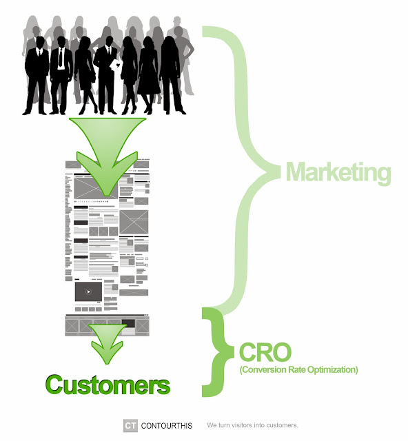
Where Conversion Rate Optimization fits in.

You've worked so hard to get visitors to your website.  Now it's time to take the next step and turn those visitors into customers.

Thursday, November 14, 2013

Why does getting personal in your content increase conversions?

Getting personal in your content isn't about your readers, its about you.  When you stop talking about your products and services and instead talk about yourself, people listen.

During my senior year in college, I took a sculpture class.  Being a fine art major, I was required to get at least a B in the class in order to pass.  That doesn't seem like it would be too hard to do, but the grade in the class was based on just 3 sculptures.  Needless to say, you had to produce all 3 sculptures to pass.

The final sculpture in the class was the infamous "Bread Box" challenge.  Effectively, you had to take an ordinary object that was smaller than a bread box (about the size of a loaf of bread) and sculpt it out of balsa wood sticks.  The catch is that the final sculpture had to be larger than a bread box.  

Now, if you've never worked with balsa wood sticks, there are some things you should know.  They are small, fragile little sticks that are no bigger around than a computer cord.  As if that didn't make it difficult enough already, the only way to connect the sticks is with super glue.  As you can imagine I spent half of my time trying to get my fingers apart.

I had taken on the formidable task of creating a lizard.  In order to meet the requirements of the task, it had to be a lizard that was larger than a bread box.  

I carefully drew the lizard out onto butcher's paper with all the intricate details to make sure I had the size right and to use as a pattern when I created my masterpiece.  I used small geometric shapes to create the pattern across the lizards back and create the form of his body.

The project was due in one week, on the following Monday.  I had estimated that it would take me about 30 hours to complete the lizard (assuming I could keep from gluing myself to myself in the process.)  So naturally, I got started on the Sunday before it was due.  

I'm a procrastinator by nature, so cramming on a project at the last moment was nothing new.  I worked on it all day and night, only taking breaks to go to the restroom and down the occasional red bull.  On Monday morning, I still wasn't quite done, so I skipped my morning classes to finish before I had sculpture class later that afternoon. 

With it done just in time, I carefully placed it in the trunk of my car and headed to class.  I only lived about 1.2 miles away from the university, so, in no hurry, I carefully accelerated away from each stop light and stop sign.  Carefully of course, because balsa wood sticks alone are fragile, let alone when they have been precariously glued to one another in a vast structure.  

About half way there, as I'm going through a green light, some idiot in a blazer chooses to ignore the stop light and tears through the intersection.  Luckily I had my wits about me and was able to swerve just in time to avoid a collision and instead ran up onto the side walk.

Pumped up on adrenaline I finished my journey to school, only to find that my sculpture was completely destroyed.  I had only a pile of broken balsa wood sticks in the trunk.  There was no way this would count as a completed sculpture, but I took the pile of sticks into class with me anyway.  Somehow, I had to get a grade for this, otherwise I would be 3 art credits short of graduating.  So, while everyone else presented their sculptures, I worked desperately to figure out how to pitch my pile of sticks.

When you tell a story it does something interesting in the brain.  Your narratives don't get digested with the cold calculating part of the brain that helps us solve Sudoku puzzles and crosswords.  It engages the older part of the brain that handles intrigue, emotion, and social situations.  The part of the brain that makes decisions before we can justify why we've made them.  In fact this is where all decisions are made.  

If you've ever known something is the right choice without knowing how you know, or felt the right choice in your heart or gut.  You have experienced a decision that the rest of your brain couldn't justify.

So, when you tell a story, you wake up this emotional, decision part of the brain and make sure that it is listening and paying attention.  By getting personal in your content and telling stories, you can get your visitors to read every word.  This isn't just about getting your message across; it increases sales because your prospects are more likely to respond emotionally vs logically.

When it was my turn to present, I chose not to try to sell my pile of sticks, rather, I told my story.  From pile of sticks to glorious lizard back to pile of sticks with a late night and massive adrenaline rush in between.  My only hope was that she could feel my heartbreak and would take it easy on me.

After a private meeting in her office, she gave me an A.

Tuesday, August 27, 2013

Where does CRO fit in?

Conversion optimization (CRO) is on the upswing.  Everyday, more people are exposed to CRO and it is quickly being recognized as its own discipline and even its own industry.  With all the other "web" stuff out there under the hat of advertising, marketing, and sales, where does CRO fit in?

Marketing and Advertising are aimed at increasing awareness and bringing [potential] customers in [to your website or business].  The goal of Sales, is to nurture a lead through the sales processes.  CRO is the missing piece where potential customers become customers.


Let's imagine your website is a grocery store.  Your advertisements and other marketing campaigns will help bring people to your store.  Once you have people in the store, you hope they will find what they need.  When they are ready to checkout or need help finding something, your sales associates are ready and willing.

It's the second sentence in this narrative, "Once you have people in the store, you hope..." where the CRO magic happens.  

A consumer's guide in 2010 reported that 60-70% of all purchases made at the grocery store are impulse buys (meaning they weren't on your list).  It wasn't always this way.  Grocery stores use to just "hope" you were able to find what you needed or that you would be willing to ask the sales associate for help.

Today, grocery stores pay top dollar for consultants who know how to layout a grocery store in order to maximize sales.  From general layout, to product placement on the shelves, and even the aisle end-caps, everything has been carefully placed with revenue in mind.  The results?  A 230% increase in sales.

Marketing and advertising brings visitors.  CRO turns those visitors into customers.

Not convinced?  How many extra items do you buy at the grocery store?

Ready to get started with CRO?
Let's talk: Jared Smith, jsmith@contourthis.com

Wednesday, August 21, 2013

The least optimized page on your site

e-commerce conversion flow

Most e-commerce websites have a "Sign in or Register to continue" page as part of their checkout process.  Many companies only even have this page because everyone else does.  This page can be a conversion killer and is often overlooked when trying to improve your conversion rate.

Pros:
First, let's look at the purpose and opportunities of keeping this page.

Getting someone's email address before they begin the checkout process allows you to re-market to them via email.  If they don't finish the checkout process, you can send them an email that encourages them to come back and finish, a coupon, or even a survey to find out why they didn't complete their order.  

Getting your visitors to identify themselves before they become customers can also help you with visitor profiling.  Many successful companies, such as Amazon, base their entire business model on visitor profiling.  Analytics solutions like KISSmetrics can help you see and track what each visitor is doing.

The final good thing about this page is that is creates an early commitment of trust.  By registering an account with you, your visitors are indicating a high level of trust (not tied to money).  If they don't buy from you today, it is likely an issue of confidence, not trust.

Cons:
There are some drawbacks to having this page as well.

Asking your visitors to create an account before they can checkout creates a barrier to completing the checkout process.  There are many times I'm willing to do business with a company but don't like the idea of maintaining an account with them.  Despite the trust required to create an account, this page also represents a barrier because it forces your visitors to make yet another decision, register or leave [or checkout as a guest].

On one website we worked on, this barrier blocked 60% of their potential customers from seeing the checkout page.

You can work to optimize this page, but the checkout and landing pages generally represent a far greater opportunity.  For this reason, few companies optimize their Sign in page.

How to test:
How do you decide whether or not to keep this page?

Start by A/B testing your site with and without the page.  This test will tell you exactly how much your "Sign in or Register" page helps/hurts your overall conversions.

Next, create an email re-marketing campaign aimed at getting abandoners back to your site.  Then, turn the register page back on and measure the return from your email re-marketing campaign.

If your email campaign has a higher return than simply sending all of your traffic directly to the checkout page, you should keep your Sign in page.

If you don't have the resources to create and optimize a full blown email re-marketing campaign, remove the Sign in page from your checkout process and send all of your potential customers directly to the checkout page.  You can always ask them to create an account after they have finished their transaction.

Have you tested your "Sign in or Register" page?
[Share your results in the comments.]

Need help testing?
Let's talk: jsmith@contourthis.com

Friday, August 16, 2013

11 ways to increase customer confidence

Trust is required to do business.  Confidence is required to close the deal.  While there is some overlap between the elements of a website that increase trust and those that increase confidence, you can't assume that your visitors are confident enough to become customers... even if they trust you.  Check out the following list for a few examples of how to build customer confidence on your site.


Consistency is Key
Consistency of color, layout, style, and messaging all help visitors know that they are in the right place and on the right path.  If your shopping cart doesn't match your website, or your landing page doesn't match your banner ad, it can be a red flag that kills your visitors' confidence.


Both of the ads above take you to the same Facebook game page, but only one gives you the confidence that you ended up in the right place.


Show Product and Company Reviews
Your visitors are trying to make 2 decisions.  Do they want to buy what you're offering, and do they want to buy it from you?  In the moment of decision, without a strong personal urge to continue (mental or emotional), they will look to the masses for confirmation of their opinion.  This is where social proof including reviews, testimonials, star ratings, and even FB likes come in.

It's not easy for social proof to change someone's mind to purchase something that they weren't planning to, but if they were considering a purchase and social proof backs their opinion, it can give them the extra confidence they need to pull the trigger.


Give Instant Feedback
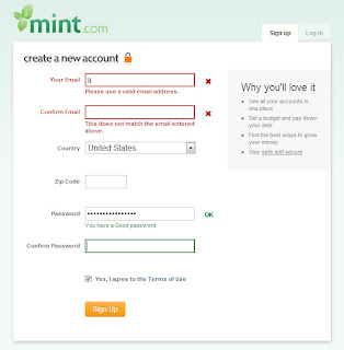
Nobody likes failing, but worse, nobody likes painstakingly filling out a form only to have to wait 5 seconds for the page to reload and tell them they did it wrong.  Your visitors need instant feedback.  Not giving them enough feedback or forcing them to wait to get it, can kill your conversions.


Give them a Roadmap
Most shopping carts and surveys are spread across multiple pages.  If you've ever found yourself in the middle of a long survey or checkout process, I'm sure you asked yourself, "How much more is there?"  This question is spawned by a feeling of being lost, overwhelmed, and frustrated.  In short, it is a confidence killer.  You should always have a progress bar or other form of visual indicator that helps orient your visitors.  The more specific you get (just 3 more questions) the more likely they are to remain confident.


Tell them what you're doing
Bounce rates, the number of people who don't hang around to play with your site, double when a page takes more than 3 seconds to load.  If you have an intense process like a flight search, 3rd party query, or extensive database upsert, your visitors get worried that you aren't responding.  A spinning wheel helps, but a progress bar and explanation of your process is even better.  This additional information gives your visitors the confidence to wait.


Show the Cart Contents (Always)
Just because your visitors get to select the exact product, color, and quantity they want, doesn't mean they won't make a mistake.  We are all human and are constantly making mistakes.  I once left my car unlocked at the airport while I went on vacation for 2 weeks!  Luck was on my side and nothing was taken, but now I lock my car 4 or 5 times just so that I can remember I locked it.  

Many of your visitors have buyers anxiety.  They can't remember if they chose the right color or size.  Travel reservations are even worse.  There are so many details to get right.  You should put the contents of your shopping cart (details included) on every page of your checkout.  This lets your visitors check their selection as often as they need.


Give your visitors control
You can try to think of all the doubts your visitors will have and try to address them at every step of the way, but the truth is, you will never catch them all.  Give your visitors a back button.  A way to return to a previous step and edit/update something they have already done.  ProTip: The best sites don't forget any information when you move back and forth through the funnel.

The MGM Resorts Job Application process consists of 9 sections you have to fill in that includes 7 years of past job and housing history.  At step 6, it asks you to give permission [to all sorts of agencies] to verify that everything you've entered is accurate.  The catch is, you don't get to review what you've entered, and there is no way to go back and edit anything.


Don't use a "Discount Code" box
In grade school, you learn that if you don't have enough to share with the entire class (or don't want to), you shouldn't bring it to school.  Having a box for a discount code makes all of us "normal" visitors feel like we missed out on something (like being the only kid in class without a lolly pop).  The determined visitors will abandon their shopping cart in hopes of finding a recent forum that has an active coupon or code.  (That's me :)  If you need to have a discount code box, make sure to offer at least a small discount for everyone.  


Clearly state your return policy
Most return policies require a PhD to decipher.  If your legal department requires that you have a convoluted policy, be sure to write a synopsis in plain English too (even if it is that you don't allow returns).  If you have a great / liberal policy, advertising it on your checkout page can increase customer confidence.


Confirmation Success
I bought a flight online the other day and after I completed all the forms with my personal and credit card information, I was redirected to the home page!  WTF?  Did I get the flight?  Did something go wrong?  I spent the next 45 minutes on the phone with customer service [waiting] to see if my order had in fact gone through.  Your visitors need confirmation that they have succeeded, no matter how small the conversion.  Whether it is a simple newsletter signup or an order completion, be sure to show a thank you page and send a confirmation email.


Make Contact Easy
You need to provide your customers with a phone number or other contact info.  If you don't want to talk to potential customers and random solicitors, you can limit this information to your confirmation pages/emails.  But, it is too easy to make a mistake and not realize it until you have completed the process.  It is also possible that there will be an error in the delivery of an order.  It gives your customers confidence when they know they can call on you.  Amazon, by the way, is terrible at this.  I paid for and downloaded an e-book that turned out to be nothing more than the title page and cover.  It took 20 minutes to find the number to call and get the order reviewed.


Confidence is driven by consistency, feedback, and control.  If you provide a consistent experience, constant feedback to your users, and give them a sense of control, your conversion rate will benefit.

How do you promote confidence on your site?

Monday, August 12, 2013

3 ways to build visitor trust on the web

Trust is a tricky thing.  You can't touch it and it isn't easy to quantify, but without it, your website is going nowhere.  Every interaction on the web is an exchange of value.  Whether your asking for someone's attention, email address, or credit card, trust is required for the transaction to be completed.

There are 2 main categories that most businesses fall into.  Those that are well known and those that are not.  For business that are well known, trust is easier.  For the rest of us, it is imperative that we know how to build visitor trust on the web.

Just like with all decisions, when we are not sure of the correct answer we look for clues and shortcuts.

Anyone can tell you that design, testimonials, and security badges increase trust, but how?

A trustworthy design is 2 things: consistent and happy.

A consistent design just means that there is an obvious correlation to the company and what your visitors were expecting to find.  Can you imagine going to the Coca-Cola website and the main color being green?  There are loads of little details that go into a "great" web design, but the most important one is consistency.  If you are working with a template, use colors, fonts, and layouts that will be consistent with your brand and advertising.

What is a happy design?  You can think of a "happy design" as a sort of Feng Shui.  We naturally gravitate toward and trust happy people (as opposed to angry people).  And so it stands to reason we would trust a happy design over an angry one.  This is why it is so hard to create a high converting site with a black background.  Also, a neutral site is just that, neutral.  To make your site design happy, give people places to rest, and use colors and pictures that evoke happy thoughts.

Testimonials are just 1 form of social proof.  You can use Facebook likes, Tweets, case studies, or third party reviews as social proof too.  Five Guys is a master of social proof.

If you see a restaurant with a line out into the parking lot you automatically assume it's great.  We humans have succeeded in advancing to our present state by relying on the experience and advice of others.  No single person has the time to experience everything, so when we are unfamiliar with a solution, we look for the advice of others.

Security badges are a form of borrowed trust.  Your visitors may not know who you are but they know the security badge.  Security badges work best for adding trust during the purchase process when you are collecting sensitive information.  If you want to build trust in other parts of your funnel, you can use the logos from high profile customers or partners.  

Borrowed trust works for the same reason your mom never wanted you hanging out with the bad kids.  You may not have been a bad kid, but when you hang out with them, others will see you as a delinquent.  If you pick high profile customers that you are proud to be associated with, borrowed trust will work in your favor.

The bonus solution here is a gimme: Honesty.  If you want people to trust you, you have to be honest, but what isn't so obvious is that you have to go out of your way to honest.  This means clearly detailing your purchase and return policies.  Explaining any caveats in your contracts up front and helping your customers navigate potential land mines.  You should even let people know why you need to collect certain types of information on your forms (such as birthdate or email) and what you intend to do with it.

Trust is a tricky thing, but being honest and having a good design goes a long way toward a fruitful relationship with your visitors.  If your conversions still aren't where you want them, consider borrowing some trust from other companies' logos and the testimonials of the masses.

How do you build trust on your website?